

Creating a restaurant - Where to start?
This project started with a blank page. Restaurant or cafe design often begins with a menu concept and/or an identity and maybe some images from the owner, chef or operator and then we start discussing and generating concept ideas. This cafe had none of those so we started from scratch.

Where
to start?
Image credit:livejapan.com
Most cafes have outer walls, a roof and an entrance, but this one didn’t it was just an open space. There was also no menu concept/identity that had really engaged the investors. So, not only did we need to develop a structure to house the cafe but we also needed an identity or a concept to entice people to dine here.
Location - The allocated space was on a wide walkway in the atrium of a hotel, a transient space that was connected to a mall and an office. Complex needs or limitations often foster creative solutions and this 18m high atrium had lots of bright daylight in the space that could be disturbing and the acoustics needed careful consideration because this cafe was close to hotel meeting rooms and guest bedrooms. Our exciting challenge was to create a destination, something that was unique to the area and compelling to guests in this complex space.
This brief: A cafe with 80 covers to serve Japanese food all day ….. We started thinking ‘what could this be?’
Typically a menu concept might include the number of covers (seats) required for a cafe design or an identity and maybe some images of the cuisine from the owner, chef or operator. This gives us a good sense about where the client sees themselves in the market. Then we start discussing the guest profile, the competition and fill in the blanks before sharing images or generating ideas. Here, we generated 3 different approaches to start with.
Thought 1 - Centered around the food. The guests are local Saudi’s or international travellers who’d love sushi for lunch but wouldn’t embrace a traditional Japanese breakfast so a migration based fusion cafe could work well - Japanese & Californian.

Image Credit:pen-online.com
We pictured this adaptable concept being based on a 3rd generation nikkeijin family in California. Chefs could utilise known Japanese techniques on local Californian ingredients or serve the two cuisines together. Maybe sashimi is served with a fresh fruit bowl or maybe there’s some Tex Mex influence too from California. The juxtaposition of the visual styles of the two places could create a really energetic, evolving cafe with an informal service style.
Thought 2 - Inspired by a service style. A ceremonial Japanese Tea House would provide an immersive experience where the staff can share traditions with guests as they wish. The service could provide a special point of difference from nearby cafes.

Image credit:Britannica.com
This concept would provide a serene place that is easily recognisable as Japanese. There could be private ceremonies for groups on quiet afternoons and tea products and paraphernalia could be sold for people to use at home. To create a visually calm space all the teahouse dimensions could be based on the size of a tatami mat and the repeated rhythm of tables and chair layouts would create order and simplicity. This aesthetic would suit the language of the building too.
Thought 3 - Responding to the space. A calming Japanese garden. The abundance of natural light in this 18m high atrium is ideal for a garden setting. The sound of running water, natural plants and dappled light would create a calm, fresh space to dine.

Image credit:anothermag.com
Japanese Study Gardens are meant to be viewed from a seated position for people to observe or paint so this would be a good grounding for a cafe. Tables could be placed throughout the garden with larger groups in more private spaces to maintain an intimate environment. There is no ‘rear side’ to living plants so they will be appreciated by hotel guests as well as cafe guests. Maintenance to the plants would need to be discussed first because real plants are essential to this idea.
These all had the potential to become good spaces but I wanted us to search for something more unique.
The idea that really captured our imagination
When looking at Japanese bakery images we noticed how many of them were cute or playful like the namagashi sweets or kawaii inspired desserts, even some bento boxes have a playful approach. Then, when looking at Japanese interiors we noticed how refined and thoughtful they were. Spaces like Kengo Kumas restaurants or Maana Kamo guesthouse by Uoya Shigenori or a traditional Ryokan seemed thoughtful and profound, the spaces may have different styles but they have some shared sensibilities. It occurred to us that these seemingly opposing creative approaches could happily coexist and even more than that, they could create an exciting and fascinating blend. Many cultures are flippant or dismissive about anything that is playful or childlike but not in Japan. Great care and attention is given to designs that are cute and in some areas it has become part of their national identity.

Bakery - Loveable, charming, surprising and fleeting. These generate smiles, delight and amazement. There is a focus on enjoying the small things. These are positive and happy, simple and cute.

Spaces - Simplicity, stillness, profundity and tranquility are embedded in the spaces. The design is considered, knowledgeable, practised and refined to create calm, timeless, reassuring environments.
We decided to go ahead and use both influences equally. We gave the cafe concept a working title of Playful & Wise.
We discussed an “Eat with your eyes” approach to the menu. Fresh and seasonal foods are not only the most flavoursome but also the most vibrant. Colourful ingredients are ideal for creating bold, playful arrangements that also have carefully balanced nutrition. With a focus on taste, texture, health, appearance and colour the seasonal menu could delight and surprise. Small plates and sharing dishes could encourage the Japanese practise, hara hachi bu, of eating until 80 percent full. They may also use real leaves and flowers as edible garnish so that even the small details are purposeful and joyful.
The staff would be very knowledgeable about pairing flavours, the development of the dishes and the nutritional value and they would be pleased to share this. The logo and menus could be inspired more by kawaii design to set the scene for a fun experience full of wonder.
The space, food and service would be steeped in wisdom but they’d also convey the awe and exuberance of youth. This cafe wants to be an experience, a place you wish to visit many times.
Image credits: tripadvisor.com and theculturetrip.com
Location - Hotel Atrium
General Challenge - This is a busy thoroughfare for people going to the gym, a flower shop, the business centre, their guestrooms and the adjacent mall so this cafe needs to “stand out” and also “stand it’s ground”.
Comfort Challenge - We needed to design a way to filter the movement and noise of passers-by so the diners can feel protected. Also the hotel guestroom corridors are open to this space so music levels need to stay low and absorptive and dissipating acoustic materials need to be incorporated to make sure sleeping guests aren’t disturbed.

Architects and designers sometimes talk about creating a space within a space and this is what we wanted to do here. The challenge would be achieving the right balance. The cafe should feel connected to the rest of the hotel but not feel overlooked. While researching materials, forms, construction details, etc this sculpture by Henk LIttlewood sparked an idea.

Bent oak sculpture, by Henk Littlewood
If a child discovered this sculpture in a clearing they would see a den, a space of their own within the woods, private but connected. We found it exciting to develop this. We imagined it scaled up and refined, with wide entrances so 2-3 people can walk in at the same time. We pictured beautiful furniture, light-hearted music and low level lighting to add further layers of comfort and refinement.

Bamboo varieties and forming techniques
To create a playful sense of exploration and intrigue different bamboo varieties and bindings could be used. The forms could vary also. It’s like walking through a forest, as you see all the different shapes, sizes and shades of trees and the variety is both enticing and reassuring. These structures would be made with traditional bending and binding techniques to also showcase adept craftsmanship developed over decades and the natural bamboo colours shown above celebrate nature’s breadth while also creating a strong base for the palette.
It’s not enough to just consider forms and materials. We consider the guest journey frame by frame, how are they greeted, what can they see, touch, hear at the same time, this can be seen in the plan.
To encourage intrigue the perimeter structures or furniture have no straight edges and the space feels permeable but for operational reasons the only openings that are wide enough to walk through are near the display counter or the greeter. As a person walks through the space to their seat the shifting perspective is like walking through that forest. The glimpses into various seating groups adds a sense of discovery as well as privacy. Also, a person could visit multiple times and have a very different perspective and experience depending on where they sit.
The pauses between the tables are very important, this negative space is full of possibilities. It adds anticipation, gives a feeling of freedom and of a promise yet to be fulfilled. The spaces between are equally as important as the seating groups.

Furniture Plan
Layouts need to equally address operational needs and guest experience. This practical layout provides a balance between fixed private areas, fixed social areas and moveable tables. There’s a range of seating including lounge, dining and high counters to provide choice. There are good vantage points for staff and easy access to the adjacent kitchen to collect hot plates or replenish the display counter.
Now that the various ideas were coming together we rationalised the imagery to convey the ideas. We sought out furniture styles, decorative finishes, hardwearing materials and accessories to build on the ideas and to make it become more of a reality.


Above. Traditional styles sit comfortably next to fresh contemporary pieces creating something that is grounded and light-hearted. It has both mature roots and fresh shoots.
The final task at this stage was to develop a sketch to convey the concept. To share the ideas with the owners, operators, chefs and the project manager. Then we could bring in cost consultants, lighting designers, kitchen consultants, brand strategists, etc as necessary to start in-depth discussions.

Early concept sketch to illustrate the atmosphere
Because there are no walls around this cafe, the design is intentionally fluid, bold and vibrant. Above the cafe people going to their guestrooms can glimpse into the space but the view is obscured for privacy. The curvaceous forms of the bamboo structures can be seen from a distance, they vary in form and tone. These create intimate seating areas for groups or for individuals to share. The craftsmanship of these structures can be seen from the perimeter of the space showcasing the high quality and attention to detail that can be found inside the restaurant and within the food offering.
To create a softer ambience in this tall space the warm lighting in fabric shades is incorporated at multiple levels. Floor lamps and table lamps provide warmth and intimacy while pendant lights give the impression of a protective enclosure above. Also the contrasting nature references are key, the young fresh bamboo is featured within sight of the gnarled dwarf japanese maple and soft laser cut illustrations of plants are woven throughout the space. There’s a contrast between old and young, real and imagined.
To develop this into a ‘narrative led concept’ we could research folktales, art, philosophy, Haikus, etc. That would be the next stage, to develop the concept further. Imagine this space telling the story of a grandparent patiently crafting a beautiful gift for their grandchild who is playing in the same space, weaving between their feet joyfully. Due to the abundance of natural daylight we could follow them from sunrise to sunset and as the gift takes shape we could see the dedication of the grandparent and feel the wonder in the child’s eyes. The relationship between them both on that single day in a lifetime could embody that connection between young and old, playful and wise.
Generating Concepts
The design process isn’t linear and there is no single formula to generating and developing concept ideas but there’s three things I always advocate:
Question everything.
Let your thoughts go beyond the brief.
Focus on the people who will use the space and their experience.
For me, original design always comes from independent thought. Even if it coincidentally looks or sounds like another design, as long as the ideas are new to you and haven’t been knowingly copied it is still original. I aspire to fulfill Sir Ken Robinson’s definition of Creativity - The process of having original ideas that add value.
Restaurant Concepts
I’d recommend considering a good brand strategist or F&B consultant at the start of a project if you have the opportunity. They have specialist knowledge and understanding that can add depth, clarity and inspiration.
Collaborator - Khue Thuy Tran. During the next stage we would’ve collaborated with the chefs, the operator, the client, brand strategists, lighting consultants, kitchen consultants, Architects MEP engineers and acoustic consultants to develop this idea but this project went on hold and didn’t start up again so the design was never realised.

Finding the big idea… and a bigger idea
Questioning the brief is the only way to make sure you are seeing the full potential. This project started out as a study to see if a hotel could fit in a specific building and it ended up as a concept for many buildings that could employ 1,000s of people.

Finding the big idea. And
an even bigger idea
Credit Image: dezeen.com
This project’s purpose was clear. A colleague, who’d been central to a train station redevelopment in London and knew the site well, asked us ‘What types of hotel could work well in a station building?’ They wanted a simple building analysis but once we started thinking about the opportunities for the building we didn’t want to stop there so we asked more questions. First we talked about the practicalities then we discussed the possibilities.
The beginning - Could this building function as a Hotel?
The short answer is yes. We assessed guest drop-off locations, delivery and laundry routes, potential kitchen locations, security, accessibility, guestroom modules, restaurant spaces and the very important guest journey. We produced test-fits showing the number of guestrooms, size of public areas, etc and documented our findings about how the space could function. We could see the site had great potential so, even though the job was officially finished, we were intrigued to take it further and ask ourselves more questions.
What type of hotel could be good for the station and the area?
What would be good for the people who commute through here? How about tourists? What would be good for local people too? How should it relate to train travel? Should we include member facilities for the train users? Would it be responsible to put a hotel here? If so, should it be inclusive or exclusive? Many scenarios would work, so we continued.
Who would our Hotel guest be?
Nomad workers? Local parents? Commuters? etc and How and when might use the space? We mapped out the times when the different groups might visit and realised there was a rare potential to create a vibrant atmosphere all day everyday. Out-of-towners could use a place to refresh, leave bags, maybe hang out for a while and get their bearings. Locals could use another place to meet, eat and drink.
To connect the station to the local community, and give the hotel more depth and variety, we decided to target both groups, to encourage them to mix and to make real world connections. We discussed what they might all enjoy, practically and emotionally, when they come together. By creating a space about shared interests, needs and values rather than where they have just come from we could create a more dynamic and inclusive environment. However, It was clear that when these different groups arrived they would need a tailored experience, so we mapped out the requirements and the possibilities. We checked what could overlap, what needed to be seperate and discussed how security and catering requirements could be managed as a whole.

The members can then enter the local area without restriction but the locals can’t enter the members area without special permission. An out-of-towner can become a member by purchasing a day pass, by purchasing a first class train ticket or through a membership subscription if they travel regularly.
How would it work practically?
We discussed how we could arrange the flow of people and proposed 2 main entrances at opposite ends, as per the sketch. This is so the locals (the community) can enter directly from the city street and the out-of-towners (the members) can enter directly from the train concourse. This way everyone will feel the building belongs to them and has been designed with their needs in mind. Typically we’d consider 2 entrances to be complicated operationally but here it made sense. This way the out-of-towners (the members) could go straight from the train to the venue without ticket barriers for seamless hospitality and the locals (the community) wouldn’t need to see luggage drop-off and check-in facilities as they enter. Current technology makes it easier to manage 2 entrances than it has been in the past so we proceeded.
It became clear that, for security reasons, the members’ area needed to be more secluded. Also travellers might need a space to decompress when they get off the train, to recharge their devices and themselves. However, if they prefer they can simply be greeted in the members area and walk straight through to the main space. The members hub and the community hub needed to be managed by the same team for this concept to work. When this was being developed Virgin East Coast Trains were serving the station so we toured their existing Members Club before finalising the details and now that we’d addressed what separated people we could focus on what brings them together.
This wasn’t really about creating a hotel anymore, the focus had shifted. It’s a venue with a friendly welcome, food and drink and a place to grab a shower. At this venue you can also stay for the night, if you like.
It’s a place to refresh.
Working title - Tonic.
How do you create that friendly welcome for members and the local community alike?
It’s all about having the right people so we put a local concierge at the heart of the Tonic venue. Your local concierge can recommend a good place for a haircut, tell you what bands are playing nearby, tell you the fastest way to get to St Christophers Place or recommend the best place for oysters or kebabs. It’s like having a local friend greet you. They know a lot about the area and are always keen to learn more.

The concierge also knows information about the destinations up and down the train line.
We knew this whole space needed to be managed by one company, one team. If this was to be an extension of the train travel experience it made sense that we spoke to a train operator now before taking this any further.
We brought in branding specialists as we developed this further and looked at how we could pitch this to an operator. A Virgin company seemed like an ideal Tonic operator, not only did they already have Virgin Hotels with The Commons Club, but also Miss Ricky’s Cafe, Virgin Active gyms and Virgin Music brands in the portfolio and they champion start-ups, disruptors and new ventures. They also have the right values as well as relevant experience. The brand specialists highlighted that Virgin are not an elitist or hierarchical brand, “the Virgin brand’s backbone is it’s values; providing heartfelt service, being delightfully surprising, red hot and straight up while maintaining an insatiable curiosity and creating smart disruption.” “internally our culture never forces people to shrink to fit but encourages you to think individually” This “is a human culture led by our hearts and our heads. We hunt for talent that genuinely cares about people, the planet and profit. This caring is plain to see in the authentic and approachable way we relate to others” Even on the luxurious Necker Island in the Caribbean the staff are approachable, fun and genuinely relate to people from all walks of life.
Our colleague had good contacts at Virgin Trains East Coast so he approached them, set up a meeting and we pitched the idea. We needed to see if they were interested in the concept and to see if this was something they could operate and provide funds to build. Alternatively, maybe they could partner with another Virgin company so we demonstrated how many guestrooms they could get in this building and how many meeting areas, restaurant seats, etc. to give an indication of potential revenue and we explained the Tonic concept. An amazing members club/venue at this London station for the Virgin customers and one that also invites the local community to be part of the space so that within minutes of arriving at the station you can feel greeted by a friend, you can refresh and you can know you’ve arrived in ‘real London’. As soon as you enter the doors you cease to be an out of towner and the experience is anchored in Virgin hospitality. The local concierge is at the heart of the space with a social hub all around. The arrivals area is slightly secluded but then all the guests share places to eat, socialise and think and members and guests can hire out rooms to meet or sleep or work.

Tonic is a
friendly
welcome, a place
to refresh.
It offers a local
concierge, a
place to eat and
a place to sit,
shower and
shave.
It can also be
a place to
sleep.
Depending on real estate leases and finance we explained how this could be a scalable concept, if they preferred an incremental investment we could start by creating a great Virgin destination for the Local Concierge, a local Cafe and an Arrivals Lounge that included a shower, lockers, etc. Then later we could expand the Cafe or add a Bar or Restaurant, add some Guestrooms, or Co-working space, add some Meeting Rooms, etc.
Towards the end of the pitch we also mentioned an idea we’d been fleshing out for a few weeks. Although we had created the Tonic concept specifically for a London venue, when we’d been discussing where the experience should start we’d had another idea that could be added on.
Travel is about the journey and the destination. So how could we create a bigger hospitality experience that connects them both?
We’d been having conversations in the background for a while, asking where should the hospitality start? (For now, we focussed only on physical spaces and ignored the on-line experience). Hospitality on the trains currently starts when you leave the station and the experience ends as soon as the train pulls into the station. People use the members’ lounges before they leave a city but it’s often just self-service. The sense of hospitality at times can be disjointed and inconsistent.
Wouldn’t it be good if before any train journey, as soon as you arrive at your local station, you know you will be taken care of. You could get there early and have a coffee, go to the gym, have a meeting or work for a few hours before your train leaves, you could pre-order your food for the journey, have your shoes polished, print documents or leave a pushchair to be stowed on the train - Depart Delighted.
Then when you get to your destination you can have a drink, leave your bags, grab a nap, enjoy fluffy towels and great water pressure in the showers, have your hair styled, collect a parcel and have someone organise a taxi or invite colleagues to meet in your members area - Arrive Feeling Alive.
There could be a Tonic at every station where you can drop our guard, relax and feel part of a community.
This was the even bigger idea.
We were proposing to consistently extend the Virgin experience beyond the train journey. All the stations would no longer be places to just pass through or navigate, but spaces where you are welcomed and feel at home. There could be hosted events or classes, games for children, local retailers and great changing facilities. It can be tailored to people’s needs. Just the Tonic.
Adjust to each station and city
Some stations on the train line had existing buildings that could house a Tonic venue and at other stations there was room to build them or create pop-ups. The idea was scaleable. Not every city would need the same amenities so they could be created to suit the local area.
Every venue needed to have the local concierge, a small cafe and an arrivals lounge that included a shower, lockers, etc. Everything else would be decided based on local requirements. One city might benefit from having a gym at the station, another might find a retail market would be better to support local businesses. The London one proposed guestrooms but other cities may not need them. The diagrams below show how the offering could change.


In order to develop this and to pitch the idea we needed clear strategic thinking so we spent more time with the brand strategists so we could understand the Virgin portfolio better and to confirm the Tonic values, develop the brand and the tone of voice. They created a presentation to succinctly pitch the concept alongside our more detailed report.
I really advocate collaborating with brand strategists, the good ones can cut through multiple ideas, pull out the best ones and explain succinctly why they are strong and exactly how they will resonate with people.


This is a brief snapshot of the idea pitched.


Credit images: All graphic images c/o Gensler
Travel and hospitality are fully intertwined in this concept. Both the journey and the train station become the destination rather than a means to an end. When people picture travel and hospitality combined they usually think of the Venice Simplon-Orient-Express or hiring a private yacht which are both exclusive and expensive, however this inclusive proposition is more like a fantastic bus tour that will pick you up from your home, take you around the world and bring you back again. It offers a sense of ease and community.
Maximum engagement, maximum enjoyment. Refreshingly different. Just the Tonic
This process included a lot of bubble diagrams and overlapping discussions because we were influenced by many things. Some of the ideas echo services provided in air travel, they respond to changes in remote working, they are influenced by hotels that attract the local community, by contemporary members clubs, by the increased engagement with market spaces and the blurred boundaries of lifestyle spaces in retail and other areas. By keeping our eyes and ears open to developing trends we can develop spaces that are relevant and useful. We were also influenced by disruptive attitudes towards business models, a sustainable and social focus on creating local employment and we were able to rethink some established practices due to developments in technology and the shift to smart tickets for travel. With so many influences it was important to keep asking ourselves what makes this relevant? What makes this different? What makes it compelling?
This was developed with a group of interior designers, architects and brand strategists, not entrepreneurs, investors or developers. We had the capability to understand how the buildings could work from an operational and experiential point of view and we had the experience of profiling guests, understanding their needs and looking for gaps in the market so we just got on with it. As always, we designed with the guests in mind to make sure our designs resonate with people and then we shared our ideas with a potential operator to turn this idea for Tonic into physical spaces that people could enjoy. Next we would’ve needed to work through all the details and our assumptions with the operator.
The original brief may have been to just test-fit one building to see if it could function as a Hotel but part of being creative is always asking questions, it’s a practice that keeps our minds flexible and open.
Collaborators were Hiro Aso, Nicola Law, Tony Wilks, Angel Sanchez, Khue Thuy Tran, Tim Hedley-Jones

Spotlighting British fashion designers
Not all projects are deep and thought provoking. This central London hotel just needed a soft refurbishment to their guestrooms and after discussing potential approaches we chose British fashion design and suggested some alternative ways guests could engage with the featured designers.

Spotlighting British fashion designers
People live out their lives in clothes and they can transport you to a time and place. Fashion can be used as a way to express yourself or to blend in with the crowd. This hotel’s character isn’t shy so we featured 3 confident designers to inspire the renovated rooms. This project only required a soft refurbishment to the guestrooms, they wanted to change the drapes, the furniture, carpets and wallcoverings to revamp the rooms with maximum impact. We chose established designers that many of the guests would recognise even if they didn’t know much about fashion.
It’s a popular design strategy to take inspiration from hyper local sources to create a strong identity. Designers often use nuanced details to create something specific to a part of a city or island, however, this luxury hotel was better suited to link to London as a whole rather than a specific district or subculture because this was close to many tourist sites and not many people live in the area full-time. Like other hotels before, including London’s famous Claridges Hotel and New York’s St Regis Hotel, we opted for fashion design as our design anchor because this would resonate with the hotel’s existing clientele.
The 3 designers selected based their careers in London and still have a presence in the city now. We were keen to make the experience more involved so we proposed in-room media, retail opportunities and events for the guests who want to learn more about the designers or want a more engaging time. A hotel stay is a great time to explore different styles, ideas and behaviours, it’s a short term commitment that can be tried on for size.
Vivienne Westwood - Known for her controversial designs and anarchic approach this provided an interesting antithesis to a traditional luxurious hotel. A striking contrast between traditionalist, provocateur, utterly contemporary, these rooms would be impactful and unexpected. Vivienne Westwood became well known as part of the London punk scene and she continues to use her notoriety to highlight ecological causes she is passionate about. Her subversive originality has influenced many other designers.

“I've constantly tried to provoke people into thinking afresh and for themselves, to escape their inhibitions and programming.” Vivienne Westwood
These rooms would capture her spirit and her creative idealism by creating an immersive space that utilises the walls, the furniture and even the ceiling to encapsulate her dynamism. Nothing would be out of bounds, the upholstery could reflect her exaggerated sculptural tailoring. Ideally some of her clothing items will be reused for the decoration of the rooms so that the fashion fabric has a second life in this hotel. Due to technical issues around fabric durability and fire resistance this may need to be limited to smaller items but every little helps to reduce waste. For this reason, some of the fabrics shown are from previous decades.


“With Westwood, what you see is what you get – pure fashion and signature style.”- Vogue


Her doodles and sketches should be incorporated on cushions and art but also in unexpected ways like on bathroom tiles or the bathroom mirror, or on a bed canopy or inside the wardrobe.


This space should have a traditional approach to a hotel guestrooms complete with writing desk, dressing table, wardrobe and lounge seating but they should be injected with Westwoods dynamism. The native south american design for wallcovering would be juxtaposed against punk references and against her 1982 medieval armour inspired designs, expressing a disregard for style ‘rules’. Westwood is an avid scholar of fashion history so this must be well researched.
More than 40 years into her career, Westwood has become a sort of avatar of herself. It’s an idea that she plays with by appearing in her own press materials and this room could be an extension of that.
While staying here, guests could watch her documentary, read one of her books in the room and if they want to take a copy home, just add it to the bill. Music could start as soon as the key-card activates the room for an immediate experience and playlists could featuring the New York Dolls, Sex Pistols, Mae West, Billy Fury and Dominik Emrich from her catwalk shows and her early stylist days. For special occasions there might be opportunities to try on clothes from the Vivienne Westwood stores in your room. If not, the porter can immediately order a taxi to her London stores.


Paul Smith - Synonymous with British tailoring. Paul’s first ambition was to become a professional racing cyclist. However, friends at the local art college and his experience at a clothing warehouse pointed him in a different direction after he was stopped from cycling.
Paul’s approach is more refined, he creates many designs that focus on a highly considered use of colour and repetition to either create block impact or to be understated but with a hint of hidden depths. Therefore the base palette and patterns would be simple and neutral with bold blocks of colourful patterns to inject vibrancy and animation. There would be small quirks and surprises for attentive guests like obscure statues or repurposed bike parts in the interior.

Smith has also created many artworks which would be featured in the guestroom alongside photographs of some of the striped art cars created over the years.


These are spacious rooms so there would be no compromises required on storage space or lounge areas within the rooms. Some larger furniture items, like the wardrobe would be of the late Victorian style to match the age of the hotel but the looser pieces like lounge furniture would have clean lines, simple forms and would be very comfortable.


Multiple iconic stripe patterns and the Albermarle pattern inspired by the designer store would be used throughout the rooms for upholstered furniture and for cushions and throws.

Guests could hIre a Paul Smith Mercian cycle via the hotel for a bike tour around London or they could book a deck chair at Hyde park round the corner (a designer deck chair was created by Paul Smith for London’s Royal Parks charity in 2010) Guests could take home the Paul Smith wash bag in the bathroom for an additional fee or even order one of the artwork prints for their home. Tea could be served in the guestroom in the Thomas Goode tea set designed by Paul too. He has collaborated with many brands like Anglepoise, Leica, Globe-Trotter and Caran d-Ache, however, some hotel guests have stickier fingers than others so featuring the ballpoint pen (£35) that Paul developed with them might be too tempting.


Henry Holland
After working as a stylist and fashion editor, Henry launched House of Holland in the mid-2000s and became a high street name when his slogan t-shirts were shown at London’s Fashion Week 2007 after the last collection was shown. Originally designed for himself and friends, these became a big hit with the public with their 80’s inspired style and rhyming slogans. Holland stands out in order to be noticed and therefore, so must these guestrooms.

The rooms should feature some of this trademark typography with cheeky phrases on artwork, menus, fire escape plans, etc.
Using block colours for the wall finishes in neutral off-whites, dark green and teal tones would create a strong backdrop for the vibrant artwork, lighting, upholstery and accessories. While respecting the structure of the building these vibrant features would attract the eye and make the space feel contemporary. The rooms would keep the traditional late Victorian mouldings, windows and doors. They would be cleaned and repaired before matt paint colours would be added.


Holland’s bold patterns would feature prominently in the rooms creating an energetic feeling with a hint of chaos.
Henry’s 2018 collection was shot against Albert Irvins artwork. It would be nice to honour the mutual appreciation they had for each other’s work by including references to Irvins work in the guestrooms if the Estate of Albert Irvin agreed.
If guests would like to replicate the hotel guestroom in their own home some of the furniture is on sale at a London department store. They could order the exact same pieces to be delivered to their house.


Or if guests would prefer to take a smaller token home as a memento, then a notebook Holland developed with Papier would be in each room as a complimentary gift, also available to guests are the tote bags he developed with Primark. If guests wish to purchase small gifts some Le Specs sunglasses would be available for people to try as well as the Six Scents fragrances. These were both collaborations with the House of Holland too. Although the House of Holland has recently ceased trading Henry continues to design and collaborate with other brands.


This was a quick process with minimal back and forth with the client. Not all projects need a complex narrative or a deep understanding of social behaviour, sometimes they are just looking for some aesthetic flair and talking points to help the staff to engage with the guests and vice versa. Depending on the client, the location, the scope and the hotel guests it’s important to find the right fit for the project. Discussions at the start of a project can identify the opportunities and restrictions. Once the concept is agreed we typically produce plans, elevations, samples and visuals for approval and costing before developing the technical specifications and drawings.
These rooms would make guests feel to these London based designers, help them feel ‘in the know’ and maybe learn or experience something new during their stay too. The individual rooms can have very different styles but they need to compliment the style of the public area by using deep jewel tones, warm neutrals and a careful curation of traditional and modern style furniture.
Collaborators were Gurtake Singh, Philip Twiss, Dan Craner and Anjana Pandya. If the project had not gone on hold while we were developing these ideas we would’ve collaborated with a wider group.
The values and behaviour of curious and collaborative city explorers
It’s important to know your guest. When asked to create a hotel for a niche group of guests who are curious, experimental and irrevocably collaborative we spent time discussing their individual values, likes and dislikes and we identified our first crucial challenge - They wouldn’t stay in a hotel.
People: Curious, collaborative explorers
A hotel inspired by specific guest values.
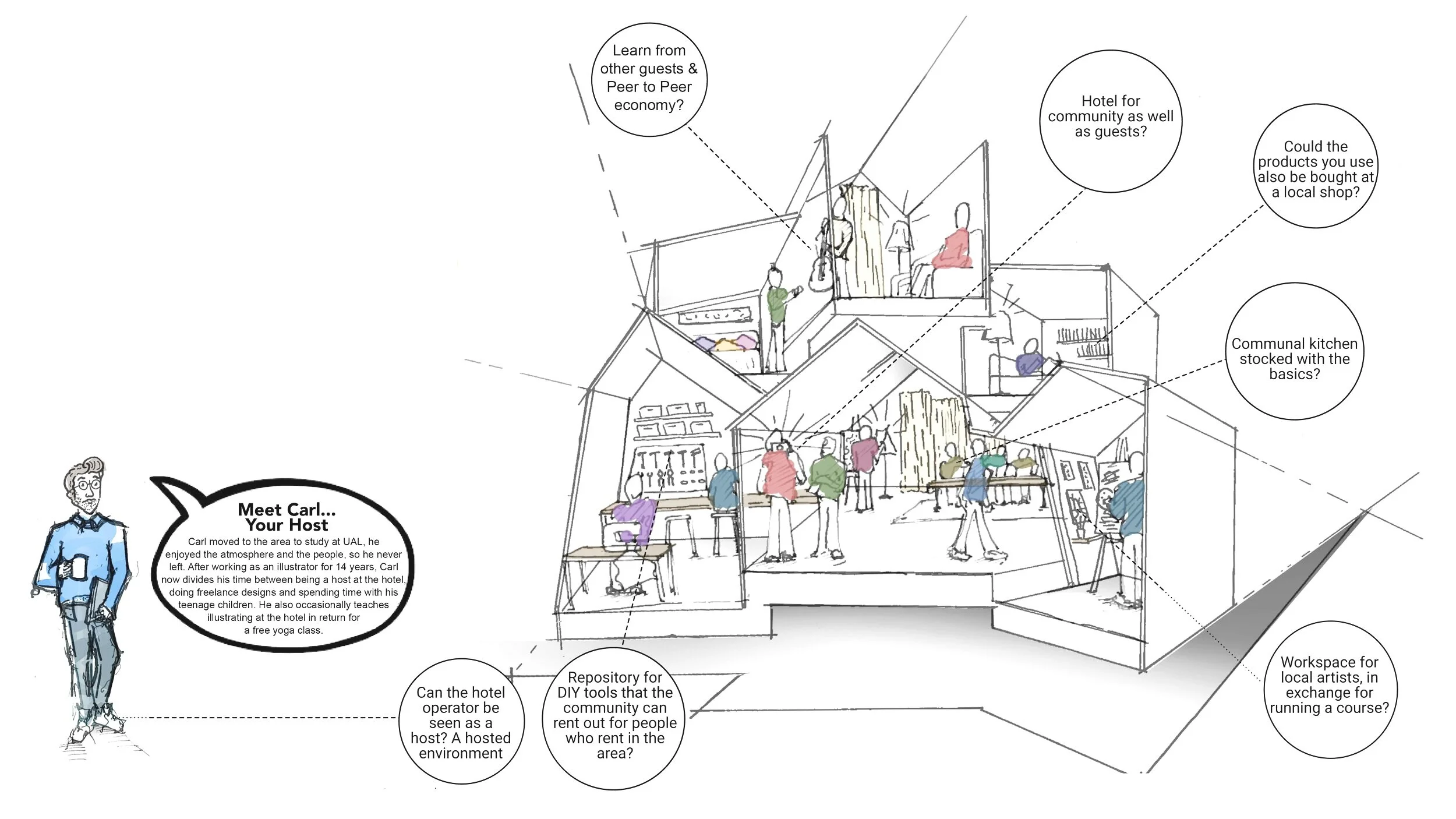
This sketch shows a reinvention of what hotel typology could be. Illustration by Sacha Bennett-Ford
Place: A city Hotel
In our current age of blurred boundaries, designing for individuals becomes even more important. Greater flexibility in working and private lives, changes to classic family structures and digitalisation of day to day living have led to societies becoming more complex and more subcultures evolving and overlapping. In order to really reach people, it’s not good enough to picture people in terms of age, occupation and income. We must know and understand their values, goals in life, lifestyles and attitudes. We must make the effort to know them as individuals, then we can design for them. The users set the ethics of the hotel rather than the owner or the operator.
We were asked to create a hotel concept for a particular group of like-minded people. This group are highly social, experimental expeditionists who feel responsible for the world around them and they like to embed themselves in communities. To understand more about what motivates them and influences their decisions we met social scientists at Sinus Institut before considering ideas about what type of hotel would suit them. Their values and ideals may have been niche in 2016 when this was developed but 5 years later many of their preferences have a wider appeal and can be seen in more mainstream markets now.
(12 min read)
Sinus Institut are a market and social research institute whose expertise in psychology, social science and market research allow them to provide holistic and accurate descriptions of social and target group typology. So they can document basic values, lifestyles and goals as well as everyday attitudes, aspirations, anxieties and expectations for the future to understand what moves like-minded groups of people to choose one item or experience over another. They provide an authentic picture of society instead of a statistical construct and their documents are constantly being updated as society changes. Over recent decades we have seen an accelerated rate of increase in the consumer culture, individualism and globalisation which has resulted in some traditionalist values declining and some rapid growth in the modern values like collaboration and responsibility for the planet.
By understanding how members of a group perceive themselves and their environment - what they do and don’t like, how they live, how they think, how they feel and how they make judgements helps us to build environments that appeal to their rational and ethical values as well as engage with the groups aesthetic, sensuous and emotional preferences.
What motivates our target guest?
The group of like-minded individuals we focus on for this project are a niche group, approx 8% of the population. They value individualism, creativity and mobility. They perceive themselves as mobile of mind and of body and they are motivated to travel for long periods of time, to explore and to connect with people. Their lifestyle is highly social and they love to share ideas, recommendations, resources and experiences. When they travel, they like to immerse themselves in the cities they visit, hang out with locals and feel what it’s like to live in the city day to day. These individuals care about the depletion of natural resources, they adapt their behaviour to reduce the impact on the environment and encourage others to do the same. They don’t fill their homes with possessions or trophies and they only lightly impact the space they inhabit. They are likely to have second hand furniture or pieces that are adaptable and original artwork, often just leaning against the wall. A great internet connection is essential because they are digitally enabled and use this as a way to connect with likeminded people across the world. They were named ‘digital avantguardes’ but we thought that conjured up the wrong image so we dropped the title.
To make sure we kept thinking of our future hotel guests as individuals and didn’t fall into stereotypes, we personified them. We gave them names, a back story and personal likes and dislikes.

Ebba and Lucas were our imaginary guests. Here’s a link to get to know them a bit better if you’d like.
It soon became clear that crucially, these individuals don’t stay in Hotels because it would limit their opportunity to immerse themselves in city life. So, as well as understanding the culture of these people we also needed to objectively look at the existing culture of hotels.
What values and behaviour do we associate with hotels?
Hotels and brands vary greatly in terms of values, service and experience. For example, if you enjoy being social and like to work flexibly you might stay at a Citizen M or an Ace Hotel and relax in their lounges and graze on snacks. If you like fine dining and traditional service you might stay at the Langham or The Edition where the doorman will greet you and the Maitre D’ will organise your table. As much as hotels can vary dramatically, we identified key aspects that nearly all hotels have in common:
Hotels typically provide an escape from daily life, they are a place to retreat to for a couple of hours and be taken care of. The staff cook and clean for you and they bring you drinks. Many can arrange theatre tickets for you and some might even carry your bags and park your car. The intention is usually to make the guests stay as easy, relaxing and special as possible and very little initiative is required from the guest.
Hotels have a routine to the day and general rules of conduct. Check-in and check-out times are standard, there are allocated times for breakfast, lunch and dinner and even a time for your room to be cleaned. It is made clear which members of staff make your drink, or organise a taxi or clean your room and these roles rarely overlap. There is also a routine or typical order to the spaces. When you arrive you expect to see reception first, adjacent to a lounge or bar, from here you are often close to lifts that can take you straight to your guestroom. These all create behavioural structure and order. There are usually fixed protocols too. The beds are made in a specific fashion, guests are greeted with a particular phrase, the lighting settings are pre-set and the mini-bar is stocked in the same order in every room. There is consistency and familiarity.
Social interaction with other hotel guests is often minimal. Typically, if people eat at the hotel they dine with their family, friends or colleagues or they order food to their room. The lounge and dining spaces are designed for small clusters of people who either know each other and there’s limited flexibility. Recently public spaces in Hotels have become much more social and vibrant but there is limited interaction with strangers in most hotels. Often the service has become much less formal but staff rarely strike up big conversations with guests, they offer service and professionalism rather than deep engagement and interactions are often fleeting.
Most of these institutional normalities are the antithesis of what our target guest enjoys. So if we wanted to attract them we needed to redefine what it could mean to be a hotel.

We addressed 4 key behavioural aspects in the development of this new hotel model for our guests.

Summary by Simon Nowroz
We created a fictional hotel to focus and develop our concept. Then we would build a physical space to explain and demonstrate the ideas to others.
A hotel for people who wouldn’t stay in a hotel
We based our hotel concept in SE London and discussed ways to fully immerse it in the local area, to become an anchor for the local creative community. The sketch at the top of this article illustrates the proposal.
Firstly, the host role is very fluid. Instead of a formal receptionist or manager your host would be available to chat with you, organise a key for your room, but they are not standing still waiting for you to need them. It’s important that the host is creative themselves. In this case our host, Carl, might be sketching or reading or talking to one of the guests about the new restaurant he just tried. He will always be available when needed, but instead of waiting and anticipating guests he is relaxed and in the moment. These more fluid staff-guest relationships would impact some of the hotel layout and the typical divide between public space, private space and back-of-house space is blurred allowing for more initiative and choice.
You can see above that locals would be encouraged inside every day to work, teach, socialise or eat, therefore, creating a place to build long friendships with people or just have a great conversation. Inspired by a sharing economy; materials and equipment could be shared or hired and teachings could be traded. It’s easy for large groups of people to eat together and cook together at this hotel and the guests feel empowered to take control of the environment.
The culture is always evolving - the people who stay here leave their mark, either through recommendations, through art they made while they were there or through recipes or books they left behind. On any given day, the hotel is only that specific environment because of the people. The connection you feel to the hotel depends on the people who were there before you and at the same time as you. Guest ‘A’ might’ve found an amazing guitar repair shop to recommend and Guest ‘B’ might’ve pinned up a sketch of Carl the host or their photographs of some interesting protestors last week. Guest ‘C’ might have an infectious laugh. In a more static environment you are only interacting with the space and the staff, here it’s the other guests that make the space unique.
Demonstrating the concept
The last part of the challenge was to build a physical environment to demonstrate the hotel concept. We had a 4m x 7m exhibition space to do this. Our hotel concept needed to be as committed and passionate as its guests, it must convey the key issues.
Firstly, this is an inclusive space. People often hesitate when they see a threshold or a defined entrance, deciding whether to cross it or not. Our hotel should feel inviting and accessible to all people so we broke up the boundary line of the space. By not having a threshold we could entice people in without hesitation.


We used individual pods to represent the guestroom, a private shower room, the social spaces and the public bathroom to provide a snapshot of the entire hotel in one small space.
We put a communal table at the heart of the space and invited makers and creatives to work there, talk to each other and talk to the guests as you can see below.


This communal table used induction cooking tech so in the evening we could warm drinks on it or cook on it and eat together, showing how this table has many uses and the guests determine how it is used.
Most of the ideas encouraged socialising but not all spaces are social. We considered the public bathroom to be semi-private because at times people have great talks in public bathrooms (below, centre image) We decided the shower room was the most private space so the shower area was raised off the floor to demonstrate this. (below, left)


We consider the guestrooms in this hotel to be more sociable and open than usual so we created a clear view from the bedroom to the public spaces to act like a window and allow the energy of the public space to flow into the guestrooms. We also proposed guestrooms that could flex to have more or less guests on any given night as they have friends join them. To show this flexibility the double bed in our space converted into a single bed and even into a sofa, similar to the image below.

The design of the space was really well received. It became animated really quickly and people understood the approach before we explained it.
The most thrilling time for us was about 30 minutes after the 3 day exhibition had opened. The ideas were coming to life. People were making themselves at home in the space.
This just kept increasing with time, people started adding their recommendations, talking to the makers we had in the space, learning new skills, reading about and talking about all the collaborators. People would come and work in the space too. When designing any interiors you create behavioural prompts through spatial volumes and materials, furniture arrangement, lighting and accessories but it’s only once people use the space that you see if people behave as you expected. It was great when our concept was awarded first prize in the competition but the real joy was seeing people use the space in the way we’d hoped.


We took a highly collaborative approach to the design, this was complicated to direct and manage but resulted in a very stimulating environment. (More information about the design approach can be seen here.) One aspect that made the collaborations simpler was that we had chosen to be experimental and by embracing this it became OK for this to not be ‘perfect’. There can be no innovation without tolerance of failure. Besides, if it was ‘perfect’ on day one then people wouldn’t feel comfortable to develop and adapt it and we would’ve missed the entire objective.


It can be a little nerve wracking to aim a design at a precise group and it can feel safer to appeal to the masses but when you target a niche group design appeals not only to those individuals but also people who aspire to be like them or who want to try it on for size and what better place to try out an alternative lifestyle than in a hotel.
It was fantastic to work with Sinus Institute, they have been collecting data since the late 1980s and their research is always evolving. Recently they have been comparing transnational similarities against local values which is fascinating to understand as globalisation increases. As part of this they explain how regional culture, traditions and customs are slow to change and I’m hopeful that embracing this will lead to more depth in more localised and authentic design. You can find out more on their website.
Influencers and collaborators were Joanna Varettas, Anna Kirkham, Nicola Law, Dunia Tigris, Florent Duperrin, Ieva Buthietka, Dan Craner, Jose Sirera, Khue Thuy Tran, Matthias Arnold, Peter Martin Thomas, Joel Butler, Leanne de Barros, Gemma Seitzer, Harry Owen, Tortie Hoare, Simon Nowroz, Claudine O’Sullivan.
Being more collaborative as designers
Our targeted hotel guests have strong ethics about protecting the environment, connecting with new people and collaborative ways of living. Inevitably we specified ethic products for the project but also we adapted the way we designed by becoming extreemly collaborative and inclusive. It was good to test ourselves.

Being more collaborative
We were inspired by our target audience - These individuals are highly experimental collaborators, they fully immerse themselves in local city life and feel responsible for the world around them. They are often self reflective and hold themselves to account so we decided to hold ourselves accountable to their standards too. We had been asked to create a hotel concept for this group so not only did we use their values to drive the ideas, the materials and the space, but we also allowed them to influence how we designed. Our future guests value collaboration and shared experiences so we decided to be even more collaborative than usual while designing their hotel to create a really authentic space.
Our hotel guests love to share ideas, recommendations, resources and experiences and to really connect with people and come together to protect the environment and support local subcultures. They value individualism, creativity and mobility and they are highly social, experimental expeditionists. This project brief was to build a small exhibit showing what a hotel for these people could look like so during the design we took chances, opened ourselves up, risked failure and changed the way we typically develop designs.
Walking the talk. (The briefing)
Three of our team attended the initial briefing with the experts but once we knew who our target guests were we immediately sent out invites for a big open briefing session to kickstart the collaboration. The guests were highly collaborative so we decided we would be too. Everyone who showed an interest was welcome and there was no prerequisite to have a design background or a knowledge of hospitality. We had about 45 people turn up; landscape architects, an accountant, masterplanners, graduates, a writer, an entrepreneur, a receptionist, a comedian, furniture makers, marketing consultants and, of course, designers and architects. Their occupation didn’t matter, their interest and intrigue did. Everyone was briefed on the ‘tribe’ of people we were designing for, they were asked to picture them, and to shout out examples and questions. This started some strong debate about exactly who these individuals were. I’d already become quite protective of this ‘tribe’ and would jump in when anyone called them hipsters, millennials or digital nomads. We explained how important it is to focus on what these people value rather than socio-demographics and to avoid thinking in stereotypes. Stereotypes and demographics can be useful for some general guidance but at a time when social identity and personal identity have taken centre stage it’s even more important to think of people as individuals or as communities.
The typical path
For interiors and architecture projects previously we’d always taken a more structured approach to collaboration. We would have briefing sessions at the start of a project with stakeholders, operators, architects, designers, strategists and sometimes locals or specialists depending on the project type. Most of these people have been involved in similar projects so they have overlapping knowledge, they have a common language and an understanding of the project’s limitations and the competition. This is when we discuss big ideas and opportunities and ask difficult questions. The overlapping experience of these professionals means we get efficient and enlightening brainstorming. Then, in order to keep projects running on time and on budget design, sign-offs are often introduced at crucial stages and the focus shifts from being about ideas and opportunities to discussions about details, problem solving and construction. It often takes 2-4 years to create a new hotel so we discuss industry predictions and new technology to make sure we think ahead, it’s a collaborative but structured process where we can develop a better hotel by working together and still stick to a timeline. For this project, it was much less regimented.
Allowing ourselves to get lost and explore freely.
For a highly collaborative approach we kept everything fluid, not only in the discussions but we allowed ourselves to make changes right up until the last minute. We started with an extremely wide brief, then we narrowed everything down to our core objectives to measure any ideas against before opening back up and allowing people creative freedom again.
By discussing specific topics like “What would these guests want to do first in a city?” “Who would they be travelling with?” “Why wouldn’t they stay in a hotel?” the debate was more lively. We didn’t have that shared language so everyone had to work harder to express their ideas. They couldn’t use industry phrases or ideologies and interestingly, this encouraged more openness and engagement. For example, instead of saying this hotel needs a ‘sense of place’ people were saying “what personality would it have?” “it needs it’s own character so people can identify with it and feel they belong”, “it needs an honest past, present, and future to feel imbedded”, “How do we make it feel like part of the local area? local people need to feel it’s their space too so that it feels genuine and real”. By not using the industry phrases people needed to engage and question themselves and this got them more excited than usual and by eliminating the idea of ‘experts’ the discussions went deeper because no-one was concerned they would say the wrong thing. Even the most experienced and confident people worry about that too. Sometimes it was complicated to talk out each point and it definitely took longer, but we also went deeper to try to get to the root of what kind of hotel would suit these future guests.
At the end of the session we asked everyone to get into groups to generate ideas and propose a synopsis for a hotel concept. They needed to share images to explain their understanding of the guest culture and make an abstract model to explain the hotel concept. They would have 10 mins each to explain key aspects about how the accommodation would operate, what it would offer and how it would appeal to this group of individuals.

Anna had been inspired by the film, Coraline. Here she is drawing everyone into her world in a pitch one evening.
There were some fantastic ideas. Different groups had focussed on different aspects of the brief. One group focussed on the sense of discovery, looking at spaces from different perspectives like squeezing through small doorways and seeing reflections. Another group focussed on the adaptability of space and how guests can transform their surroundings and one group proposed a venue that doesn’t have guestrooms at all, but instead it’s a social space open 24 hours a day that holds the keys to rooms or flats in the area. But all of them had a few things in common; they focussed on being immersed in the city, on having freedom to make things happen for themselves and socialising with people they are yet to meet.
We decided to create ‘A social sharing space that connects to the city with spaces to grab some sleep and freshen up.’
There was no fixed style or narrative, no fixed colour scheme, no preconception of what it would look like, but a strong concept of what it should achieve.
The only way we assessed any design ideas was against our core objectives about the future guests, we even graded the ideas against these:
Does it show that our guests are highly social and interactive?
Does it convey our guests’ creative and experimental nature?
Does it demonstrate how much our guests are inspired by the cities they visit?
Does it represent their drive to interact with the local creative community and how they give back to the community too?
At the same time we ran through the smaller criteria to help develop any chosen ideas. Could someone understand all these points (above) within the first 10 seconds? How does this room convey the digital socialising that is a big part of our guests’ life? What makes it sustainable and ethical? How will this make the exhibition visitors identify with our guests? Would they objectively observe them, feel like one of them or act like one of them? Our final question to ourselves was was more subjective - ‘Would this inspire you?’
It’s complicated to herd many opinions without even a vague aesthetic for the creative to buy into. Also, it’s hard as a designer to relinquish control of all of those guides simultaneously, especially when the place will be judged on how it looks before it’s judged on how it will make people feel or act. Completely letting go was the right thing to do in this instance to achieve something authentically organic, if you actively design something to be ‘undesigned’ the soul is missing so while it might convince you in a photo it isn’t convincing in real life. Many people return to a place because of how a place made them feel.
Later we reduced the team down to a smaller group who were willing to dedicate the time and energy to make this a reality. The collaboration continued within this group and local manufacturers and crafters were invited to join the group and share their opinions and propose products they thought would appeal to the guests values.
As mentioned, our guests feel responsible for the world around them so when we were looking for manufacturers to collaborate with they needed to share these values. 4 products are featured here that focus on somke key values - sustainability, supporting local artists and makers, reviving traditional skills with new ways of thinking.
Lithoverde from Salvatori (below) is the first product. This recycled stone surface has a beautiful texture with every block resulting in a unique pattern. It is 99% composed of offcuts, with the remaining 1% being a natural resin binder. Innovation can come from unlikely places, including, in this case from landfill. Salvatori created this product because an architect needed a sustainable stone for a project This shows that consumers can directly drive product development.


Buzzifelt, by Buzzispace made from 100% upcycled plastic bottle waste, recycling approx 7 million plastic bottles per year to create acoustic felt Panels. The Sliced Buzzifelt (above) are felt trimmings from these panels processed into striped patterns to create more acoustic panels and at the end of it’s life it can be upcycled a third time into new raw material, like flock for cushion fillings. This gave us fantastic acoustics in the bedroom area to create a calm and comforting environment.

We first saw Stephen’s London artwork mapping the city’s shifts, stories and secrets in pictures - part oral history, part folklore, part personal homage. It is, also, an act of reclamation, reminding us that the built space is ours to live within and reaffirming the thing that really binds the city: the stories all of its citizens share in their heads.
His work is crowded with today’s (sub)cultural symbols and obsessive tendencies; but it also celebrates traditional techniques, craftsmanship and Romantic notions of place. Walter combines history, trivia, personal experience, local knowledge and imaginative additions to creatively explore an area in all its contradictory complexity
In the end we decided against the maps and selected Cyclesea (above) because bikes are the prefered way for most of our guests to explore the city so the idea of a sea of bikes seemed ideal. Newmor applied the illustration to a wallcovering suitable for this busy space.

Tortie Hoare makes high quality handmade furniture crafted with natural elegance and sustainability at the forefront of design (barstool, above). Many items in the current award-winning range use a technique called ‘cuir bouilli’ to mould the leather, removing the need for resins and plastics. ‘Cuir bouilli’ was commonly used to make medieval armour before steel. Combining old techniques with contemporary design creates a unique new range of furniture. Like many of the leather pieces of furniture the Ridge Seat is hand stitched and hand crafted. It is also very lightweight, versatile, and comfortable.

We mentioned to Modus that we were creating this design and they were keen to be involved so they gave us a ‘Casper’ and we agreed to auction him after the event to raise money for refugee charities.
When Michael Sodeau designed a stool made from recycled cork, he added to its simple silhouette two holes that would make the stool easier to move around. These two little holes became eyes and suddenly Casper was born. The anthropomorphic touch that lent Casper an embryonic personality led to a collaboration with Movement on the Ground, a foundation that supports refugees by identifying gaps in available aid and providing practical support. 10% of the profits from the sale of every Casper stool go directly towards providing safety, shelter, food, water and medical aid to refugees and 16 stools were given unique designs before being sold at auction.
The fit-out company joined us too, to work through the drawings, co-ordinate the trades, create mock-ups, resolve assembly and disassembly (because we planned to take the space on tour after the exhibition) shifted to the building of the space. And a few more collaborators came on board later on. We knew a local DJ who created a mix for us, a local rep for an art curator took to the streets to photograph the local area of our fictional hotel and people baked cakes and picked lavender to make sure the space felt even more welcoming.
Little known fact - the contractor who installed the wallpaper in the title image was also a natural creative who left his mark, the donated wallpaper sample ran out of pattern he penned in a slightly larger fish at the top and it looked fantastic. When you are used to drawing all the design details ahead of time in a studio environment you can forget how resourceful, creative and multi-talented everyone on-site can be.
What better way to extend the focus on collaboration and shared experiences than to invite makers to the final designed space to work there, to talk about their products and show visitors the details about how they are made and let them have a go for themselves.
More details about the final concept and how the design developed into an exhibition piece can be seen in this article.
Continue reading below to see more products featured in the design and a list of collaborators.


More products…


All the materials used were generously donated by the manufacturers or loaned to us by the makers.
Collaborators were Joanna Varettas, Anna Kirkham, Nicola Law, Dunia Tigris, Florent Duperrin, Ieva Buthietka, Khue Thuy Tran, Gemma Seitzer, Harry Owen, Tortie Hoare, Helen Osgerby, Oli Morgan, Simon Nowroz, Claudine O’Sullivan, Jessica Nebel, Alex Despature, Paul Meates, Trevor To, Muir Baxter, Camille Lee, Jennifer Gray, Nick Mcloughlin, Zeyn from S&T, Otto Dent, Rachel Barnes, Kate Forrest, Alison Clark, Ashraf Ali, Chloe Muir, Leanne de Barros, Karen Ihlau, Craig O’Halloran, Laura Warholic, Matt Brien, Kama Koska, Maria Charalambous, Stephen Walters.
Nothing is created in isolation
We are all inspired by what we see and hear or what we have experienced. Designers learn how to generate ideas on demand, explore lines of thought and rationalise them. Still, sometime the ideas seem to come from nowhere and it’s those ideas that can feel more ‘inspired’.

Nothing is created in isolation
We are all inspired by what we see and hear or what we have experienced, whether we realise it or not.
Designers need to produce new ideas on demand so we learn strategies and techniques to help us generate good ones quickly. For interior design we analyse the surrounding area, the building, the users, the local culture, the competition and depending on the type of project we’d consider the brand, the cuisine or the company values. However, sometimes ideas come from an overheard conversation, an obscured image or a scene in a film. Then, there’s an inspiration source that is harder to pinpoint, we subconsciously absorb images and ideas in our day to day life and they can emerge in our designs.
(5 min read)
As part of a larger project, we needed to quickly create an image that would show we were designing a place to attract like-minded creative travelers who search for and share compelling experiences through everyday interactions (what could be simpler?). A place where people can absorb the energy of the people around them - It should be about sharing ideas and recommendations with the world. It needs to be a teaser so it should be intriguing and not too literal.
This was developed a few years ago so I don’t remember the whole conversation but it went something like this…
How do we show that they seek out new experiences and share ideas and recommendations?
“How do we show people searching?” “How about we show them foraging for new experiences? We could feature urban foraging for food and have city venues sprinkled among the undergrowth.” “But we need something that illustrates how they like to share. We could show a meal made from their findings.” “Or, how about using images of geocaching? We could show clues and/or hiding places across the city.” “That relies on a lot of people being familiar with geocaching but it’s good that it has the digital connection. What else?” “How about using the Stephen Walter’s Hub map we were told about and overlay recommendations, we could include a live link to the map so people can add to it? Or, we could sketch lots of people and show them all shouting out recommendations to each other?” “How about having someone scrolling through a magazine site on a phone that recommends undiscovered places? or show a phone, tablet and laptop all covered with places to visit.” “It probably shouldn’t include digital technology because that either makes people focus on the hardware or the software and not on the function or the feeling of technology.”
How do we create an image that also shows this is an experimental or creative place?
“How else could people creatively share recommendations besides using technology? by talking? by holding up a sign?” “by pointing and posing?” “by letter or note?” “We could include handwritten notes pinned up showing recommendations. That idea feels too small, too limited though.” “What if you wrote a recommendation then folded it into a paper aeroplane and launched it out the window. People would be intrigued if it landed near them. The might pick it up and have the urge to fly it themselves.” “It’s a great way to reach out to somebody you don’t know. They could then re-launch it for someone else to discover.” “Also, that idea mirrors how we use social media sites, we post our thoughts or experiences for the world to see.” “Has anyone else seen the Paperman, by John Kahrs?” “Paper planes would work well, let’s go with that.”
“Instead of handwritten notes the planes could be events flyers and tickets from around London. They would illustrate how people share their recommendations. They are sent out into the world, not knowing where they will land and who will read them but they send them anyway.”
So, a recommendation for a restaurant like Rola Wala at the Street Feast Model Market in Lewisham could feature one of their menus folded into a plane. You’d choose your food, add some recommendations and launch the plane to tell people how good it was.

Exciting exhibition at the British Library. Great fanzines. Punk is not dead.
#Punk1976_78 #BritishLibrary
Tasty naan roll, really fresh and delicious. Great options for veggies too.
#RolaWala #Lewisham #StreetFeast

On the way home after our brainstorming I was checking emails and as I hit ‘send’ I realised where that subconcious influence had come from.


All of a sudden I realised it was on most social media sites or messaging apps. Initially I was disappointed because the idea now seemed less original. However, I had to admit that this visual reference to the digital world was actually perfect. It added a connection to sharing ideas in the digital world and extra layer of depth that links back to our group of people who avidly shared their experiences online.
The digital icon had been developed to symbol sending a physical message and now we were using physical paper planes to represent sending digital messages. The reference had gone full circle, back to a physical object. Does anyone know how/why/when the plane icon was developed for digital messages?
Found something good? Want to tell other people about it? Launch it into the air for a like-minded person to find.
The final poster photography

Image title: Unscripted paths and connections
An expedition into the known and unknown, a journey of brief encounters, true stories, found sounds, sharing with those you meet along the way. Absorb their ideas and energy and give back some of yours in return. The more we share, the more we get back.
We are all inspired by what we see, hear or feel so it’s fascinating and exciting to work with designers and clients from all over the world. Our early experiences and influences vary from country to country and this impacts our interpretation of spaces and behaviours. These influences are often referred to as subliminal or subconcious and they all come from our individual exposure, experience and perception. When you find an idea that can be understood by designers of different ages, nationalities and backgrounds you know it will resonate with many people. Some ideas don’t translate as easily, but identifying these means we can create the right context for them to be understood or move on to the next idea. If you want to explore this more you might enjoy Daniel Kahnemans writings about decision making, judgement and behavioural ecconomics or you might enjoy Charles H Burnettes papers on A Theory of Design Thinking or The Role of Aesthetics in Design Thinking.
Generating ideas on demand
At the start of this article I mentioned strategies, techniques and processes designers learn to help generate ideas. I’ve sketched out my design map to help illustrate some of the points I consider.
My design map

Collaboraters and influencers were Joanna Varettas, Anna Kirckham, Dunia Tigris, Rachel Barnes. Also, Leila Cook for introducing us to Stephens designs.

Designing to a human scale
Large spaces can be awe inspiring but they can also lack a human touch and the feeling of warmth, comfort and connection that people desire. Different strategies and design techniques can make people feel at home in these spaces, like in this adapted Kenzo Tange building in Saudi Arabia

Designing to a human scale
Large internal spaces can be powerful and awe inspiring but they can also lack a human touch, a feeling of warmth and a connection.
It’s important to feel welcome and comfortable, especially in hotels. By focussing on tactile materials and layered lighting, by using dimensions and details that relate to the size of a human body and by introducing visual breaks we can create spaces where people can relax after a long journey.
Photograph: Approaching Shadow, by Fan Ho from Fan Ho - Forget Me Not .com
We were appointed to convert an office and residential building into a luxury hotel. The biggest challenge the building presented was to find ways people can feel at home in the main atrium space and feel connected to other people in the hotel. We needed to create a warm welcome in a space that currently prided itself on efficiency, privacy and separation of functions.
Existing Kenzo Tange office, conference centre, gym and residential building completed approx 1982. To be converted into a luxury hotel.


first impression
This is a powerful and bold building. Guests will have seen the image above from the road, the taxi will then arrive on the road to the right and the first impression people have when they walk through the door needs to be equally as strong as the one from outside.
We explored 2 different experiences. The first one is calm, private and full of promise. The second one is animated, more informal and inclusive.
The first option focussed on building suspense. As you walk in from the heat and the bright sunshine you detect the cooling air and low-level lights, they let you know you have arrived somewhere exclusive. The heavy textured plaster walls on each side are grazed with light and they focus your view ahead to reception. The space is calm but on either side there are glimpses into relaxing intimate lounges where you can socialise with drinks and lite bites.

The animation and brighter lights of reception ahead allows you to know instinctively where to go and as you get closer the whole space opens up in front of you to reveal a stunning arrivals desk and the impressive atrium volume. This approach is sophisticated with heavy, high quality materials providing a sense of arrival. The drama builds as you move through the space like the opening credits to a film, slowly preparing you for the main event.
In contrast, the second option brought liveliness to the forefront. This time, as you enter through the main doors you are greeted by a wide, bright comfortable lounge space with a refreshment display counter at the centre. We would loosen up the seating groups and this space would be animated with people, art and music.

Both perspectives by Illustrator Nigel Donovan
As your bags are taken by the bellboy you can collect a drink and rest for a while or continue straight ahead to reception in front of you.
We discussed abolishing reception pods in favour of mobile check-in greeters for this option but the more traditional guests who will frequent here prefer formal service. The main atrium space is slightly calmer with water features and smaller seating groups where people can talk privately.
Both options used different approaches to volume, space, light, privacy, and service style to create very different experiences.
Layout and navigation
When you arrive after a long journey, the navigation should be instinctive. You should know where reception is without having to read any signs.
Many layouts were tested to see what would meet operational needs, suit the building form and create the right emotional journey of the guest. A traditional guest may prefer formal zones for seating or dining away from reception. An adventurous guest might like to find hidden gems. A sociable guest might like to be in the limelight as much as possible and all of these impact the layout. Placement of screens and furniture within a large space can have a large impact on the ambience.
We explored fragmenting the space to make it more informal, blurring boundaries to encourage interaction and interspersing circulation routes with lounge areas to find solutions that work experientially and operationally. We traced guest journeys from the entrance via reception and up to the guestrooms and on to the restaurants, ballroom, gym, etc and we explored how staff could serve drinks and food discretely from the kitchen. Layouts are drawn in 2D but the space is always imagined in 3D. It’s imperative to understand the environment you need to create as the plans are developed, the plan and the atmosphere need to be developed together. As a result of these studies we suggested fairly significant architectural changes.

One of approx 12 layout sketches
It also became clear that the best location for reception was in the 25m high atrium, at the heart of the space. The hotel operator was clear about how they wanted the guests to be greeted, they wanted low desks that encourage the guests to sit while they check-in so we concentrated on creating more intimacy here through lighting, a warm backdrop and by floating a ceiling above.


This formal style of service was preferred by the operator so we needed desks rather than pods or IPads and we needed to provide a contemporary backdrop for attentive, impeccable service.
Atrium Space
The size of this space was the biggest challenge and it’s a large proportion of the public space. In order to make guests feel relaxed and welcome the atrium space needed large interventions as well as good placing of materials and furniture. The 3D models allowed us to test ideas. The existing space was impressive but inhospitable and the facade glazing resulted in imbalanced lighting, it was very bright at either end and very dark in the centre of the space.
Test: Opening up the space - By stripping out all the internal glazing and partitions at low level, opening up the balconies people can connect with each other and have clear lines of sight. The guestroom corridors were opened to the atrium and all the balcony facades were tapered to make them more engaging.
Test: Diffusing light and creating shadows - The lighting designer studied the light levels and explored using taut fabric sails to diffuse the natural light and to create shadows. Guests can easily relate to the shadows on the ground and feel like they are under a tree canopy
Test: Adding restaurant pavilions and key features - Not only do these animate the space with the activity of cooking and ordering food but also adding single story structures within the larger volume makes the scale of the space easier to comprehend and relate to. It provides a respite from the high spaces.
These tests allowed us to select the best direction for the design together. Now the planning approach and the large scale interior architecture had been explored it was time to create a final layout and spacial design then focus on the the details.


layering materials and lighting
Lighting is key when developing warmth and connection in a space, in such a large space it needed to be layered and considered and we worked closely with the lighting designers. By using films to filter the natural daylight as it comes into the building but also using ceiling louvres to filter interior lighting we could balance the space and make the building feel less weighty. Behind the decorative ceiling louvres we used colour changing lights to mimic the colour temperature of the natural light outside, they would provide a cooler white light in the morning and a warmer white light in the afternoon giving people the sense that real daylight was coming from above and creating shadows within the space. Next, by washing surfaces with warm light we could draw attention to particular surfaces, like behind the reception area, enticing people to gravitate toward the lit surface. Spotlighting was introduced as required to light navigation paths and to light key items then decorative lighting was added to create focus above the reception area and to provide intimacy in the form of table lamps and floor lamps.


Examples of filtered light, shadow, translucent materials, washing light on surfaces and feature lighting.
The operator wanted a calm, warm and refined space so the materials and lighting were carefully selected. Instead of making the whole space opulent we focussed attention on the materials you touch and see up close. People rarely appreciate materials until they get close to them so this approach made sense. We focussed on developing sophisticated screen details, door pulls and feature lights as seen below.

We also started to introduce planting on the corridor balconies and in the restaurant. All these decorative features relate to the size of a person and wouldn’t look out of place in a single story space. They make the space more intimate, feel luxurious to touch and show people care about the attention to detail which in turn make people feel valued.
The images below show how some of these techniques were applied. You can see a warm timber and decorative mesh feature wall washed with scalloped light behind reception to entice guests to come closer. This goes up to the underside of a 10m high bridge link we added to the guestroom floor above and creates a backdrop for the decorative pendant lights. We opened the guestroom balconies to the atrium and clad the underside of the balconies with acoustic timber panels, we washed the guestroom corridor ceiling planes with light to make them more intimate and by introducing this light wash at every level it made the building feel less heavy. We introduced new angled and stepped planes to conceal light fixtures and air conditioning grills. Most of the materials used here have warm tones and are tactile. Finishes like walnut, polished plaster, natural stone, metal resins and textiles add visual and physical comfort. Tinted mirrors reflect the animation of the other guests and slatted timber finishes reduce the scale of the space.

Image Credits: Gensler
Many surfaces have been pulled away from the structure and layered to create shadow gaps creating the illusion of light, free-standing protective pavilions within the larger space and in general. To build on this intimacy most of the lighting is below 2.4m high to focus guests eyes at a comfortable and relatable height and to highlight the texture of the materials. Only occasional spot lights are in the 5.5m high ceiling.
The result of using these techniques is a warm, inviting space where people can socialise. These can be applied to designs that have very different styling. It’s about considering scale, volumes, light, privacy, navigation and material application and many examples can be found in museums, art galleries, libraries, malls, airports and stadia as well as hotels.
One of the interesting challenges of developing this large space was the acoustics. A space can be designed to look inviting and intimate but if there is too much echo when you walk through or if it feels so quiet that you are wary of making noise the atmosphere is ruined. We worked closely with the acoustic engineers on this project. In the end we incorporated 2 water features, equally spaced, to provide pink noise and we specified an acoustic render for the upper balcony facades to reduce reverberation and we specified acoustic timber panelling for all the ceilings to make voices in the lounge areas more intelligible. We also needed to address heating and cooling, because we had removed the glazing on the balconies, the air conditioning strategy was made more complicated and because this was such a clean and simple building we wanted to avoid placing large air grills everywhere to rebalance the air flow. We worked closely with the mechanical engineers to incorporate recessed linear air grills air around the perimeter of the space at approx 4m high and to incorporate recessed linear supply and return air grills along the open corridors. Everyone worked together well to achieve a clean design.
Collaborators were Emma Williams, Graeme Davidson, Dan Craner, Marcel Ortmans, Jose Sirera, Nicola Law, Scott Farrar, Ieva Butkeviciute, Khue Tran, Maeve Larkin, Simone Schlueter, Armando Iarussi, Helen Sheldon, Peter Veale.
Atrium hotels referenced during concept: The Opposite House, Beijing, Mandarin Oriental, Barcelona, Atlanta Marriott Marquis Hotel, Westin Hotel, Xi’an and others.